Exhibitions-Art
Exhibitions-Art
Exhibitions-Art; Warhol Is Here, Postodernism, Loud Flash, Subversive Desin, Pauline Boty; Artist and Woman, The Quay Brothers Universum, Richard Hamilton, Someday, All the Adults Will Die, Eduardo Paolozzi.
‘Warhol Is Here’
Bexhill De La Warr Pavilion
Saturday 24/9/11
You might be thinking, as I was, that almost everything that could be said about Andy Warhol, has been said, many times over, leaving us with little need to repeat still further. The fifteen minutes of fame he predicted would be everyone’s lot seems to have been multiplied many times for the saying’s originator.
From his beginnings as a graphic artist, window dresser and advertiser, to his creation of an alt-celebrity club for fellow artists, to his acceptance by the smart set and his tragically early demise, all have been noted, annotated and endlessly repeated, like so many of his silk screen paintings, that we are left wondering what else could possibly be left to discuss. A selective overview of Warhol’s popular works is one answer, and ‘Warhol Is Here’ on display free at Bexhill’s stunning architectural show space, the De La Warr Pavilion, is well worth the visit.
Taking place on three levels of the crotchet-shaped building, the main hall guides us through works by genre, starting with the earliest, where Warhol incorporated rubber-stamp images to create pictures, often getting friends to finish what he had begun. The floral and angelic themes made these composite pictures resemble Victorian ‘scraps’. His shoe and hand fetishes were apparent even then, with the familiar heel-to-toe silhouette of a ladies’ shoe and the caressing hand touching a kitten turning up like advertising images, something that would later earn him a living as an illustrator.
This comforting world of leisure and pleasure quickly gives way to more in/famous images as we see the news-reportage image of the Birmingham, Alabama race riots, a police alsatian biting the trouser of a fleeing man as police officers, billy-clubs at the ready, wait to pounce.
Aside, a stack of white boxes advertising pan-shining pads await unpacking, and ahead, the ‘Marilyn Monroe’ diptych, on loan from the Tate, hangs defiantly staring out at us. These repeated, slightly offset images (colour on the left, black & white on the right) have become even better known than the original photographic image they were based on, and still have the power to fascinate as they seem to suggest a side to the star her studio would never have promoted.
Separate, differently coloured images of Chairman Mao-Tse Tung have his genial grin as the focus, at odds with his administration’s brutal treatment of any degree of dissent from its people. Warhol’s indiscriminate fascination with celebrity, however garnered, is well represented by just these two, even though many more adorn the walls.
Warhol’s love of Americana is unavoidable and central to his work, both its positive, all-inclusive side (brand-name canned soup, a single can, rather than one repeated on an industrial scale) and its dark side (electric chair, the variously coloured images chilling in their intensity).
His more human side is apparent in the nudes, among them a beautiful Venus rising from her shell, slim bodied and demure, and the highly charged homoeroticism of the male nudes. Warhol’s self portraits in conventional clothes and a series of blond wigs raise questions which he usually answered, if at all, in dull monosyllables.
Warhol’s tendency to ‘direct ‘ paintings, at least as often as painting them himself, throws up the question of authenticity, probably none more so than the films his name was applied to. There is no doubt about the publicity this name generated for them though, and some beautifully preserved examples of the posters are here, largely in German language format. They are possibly the most telling of exhibits, as the films tend to follow popular themes of the 60’s & 70’s, Chelsea Girls (basically a portmanteau film) Blue Movie (anything but) and Blood for Dracula (horror, in 3-D, another gimmick) but with the art house twists that major studios were shy of. The posters advertising shows at the Fillmore Ballroom and the Scene offer a rare glimpse into the world of the much talked about but rarely seen Velvet Underground, Warhol protégés and Factory house band who would slowly acquire a cult following and later still, worldwide fame.
The smaller, first floor room is made suitably claustrophobic with ‘Cow’ wallpaper, paranoid maps of Cold War-era USSR and its reputed missile stations, huge dollar signs and double-take faces, a nightmare in silk screen, reflecting the darkest recesses of Warhol’s psyche.
Perhaps in tribute to the multi media shows the Velvet Underground played, the second floor has a round table of cassette tapes, loaded with interviews with various people who knew Warhol, among them Brigid Polk/Brigid Berlin, one of the Factory’s long-term habitués. Apart from winning this writer’s personal seal of approval for classic technology (you know, the sort that has four buttons which do what they say on them), they open a window on as many opinions as there are speakers, sometimes more than one.
This exhibition is free and those of you who are new to either Warhol or Bexhill’s magnificent De La Warr Pavilion have until 26th February 2012 to see it.
Scenester
24/9/11
Haunch of Venison, 6 Burlington Gardens, London W1S
24/9-30/10/10
The punk grapevine is still alive and well and transmitting its message to everyone at the former Museum of Mankind, in Burlington Gardens, London. Renamed the Haunch of Venison, which I thought was a pub in St. James’s, the old museum building provides an excellent exhibition space, and its proximity to the home of tailoring, Savile Row, makes an appropriate counterpoint to the theme of the show.
The lure of seeing a large collection of original punk posters from the incendiary late 1970’s was enough for me, and the promise of some more germane period material made attendance an immediate priority. With rock music ‘antiques’ such as festival posters and photographic portraits now reaching stratospheric prices, it made a welcome change not to see tour itineraries in hardwood frames with a four-figure price tag on them. Instead, the walls of HoV are emblazoned with original, creased, tattered and torn posters, flyers and newspapers, some bearing signs of having been ripped off the wall whilst the paste was still wet.
Curator Tony Mott has assembled a staggering collection of material, mainly gig and tour posters, from the luminaries of that particularly volatile and surprisingly varied movement; like The Sex Pistols, The Clash, Subway Sect, X Ray Spex and Penetration, and even The Police. The age of paintshop graphics and 3D animation was a long way away when these came off the printer’s rollers. The prevailing aesthetic of punk was ‘trash’ culture, with its ‘ransom-note’ lettering, photocopier-quality band pictures and bold flashes of contrasting day-glow colour enlivening many of these eye-catchers, fly-posted on an urban brick wall near you almost 35 years ago.
The passage of time has not, however, eroded any of punk’s power to shock. The art students among you may draw a comparison with the anti-art movement of ‘Dada’, that surfaced shortly after, and as a reaction to the Great War 1914-1918, whose sworn duty was to shock, offend and disgust. Punk did a lot of that, and with design giants like Jamie Reid providing the essential graphics to complement, and indeed, intensify the impact of the music, we may well have found punk’s unexpected ancestor in immediate post-war Europe.
I cannot pretend that it was for purely aesthetic reasons that I attended this exhibition. Nostalgia may largely be a waste of time, but in this case, it is an educational use of time, and one that does not, like mere nostalgia, leave you with a warm, self-satisfied glow, but more an unsettling feeling of approaching danger. It begins as soon as you walk in, and although it forms only a small part of the exhibition, evokes a nervousness that continues well beyond the main collection and long after you have left the hall. The material I am writing about is the political content from the atrociously misgoverned 1970’s, and it isn’t pretty.
Much of the material on display was, we learned, given out on the streets and the football terraces of London, and it must have been a brave and selfless soul who kept it this long. Alongside the cheap and shoddy Jubilee plastic carriers and table napkins, printed with inaccurate Union Flags, and pictures of HRH in her civvies and wearing a modest crown, there are the small, privately printed tracts of organisations like the National Front, the British Movement and their offshoots. Pocket sized and bearing arcane symbols like the encircled cross, their covers told stories that are enough to freeze the blood (or boil it) and the sheer hatefulness of the attitudes expressed in them is staggering. National newspapers of the period were well represented, and some of their sentiments were not so far away from those in the fascist papers, using racial slurs and epithets that would not be acceptable in today’s papers or workplace, but all common currency in that far distant decade.
The opposition to all this xenophobic immigrant bashing was happily on display too, in the shape of the many organisations that marched along with the Anti-Nazi League. Their poster for the Victoria Park concert is known by a whole generation who hit adolescence in the late 1970’s, still sticking to the punk aesthetic of simple design and few colours, it belied the sheer diversity of the music that greeted the marchers after their protest. Reggae and blessed-out lovers rock played alongside snotty punk, and my companion of the afternoon fondly recalled many details about the gig as soon as the ‘arrow’ symbol of the A.N.L. came into view. ‘Disunited front’ would not, I think, be an inaccurate or insulting term to describe the organisation, encompassing as it did, socialists, anarchists, liberals and many other colours of the political sample book, and there was no denying they knew how to hold a party.
Taking in the gig posters, the names of many bands I had forgotten suddenly leapt out of my memory, transporting me back to the smaller North East England gigs I attended then. I would guess it’s not everyone who remembers the Suburban Studs, but east to imagine a group of lads today, calling themselves by the name without the irony that must surely have informed the original band’s choice of moniker? Nor would the average punter recall with much clarity the Desperate Bicycles. Far more familiar would probably be The Lurkers (who did) The Unwanted (who were) and The Damned (who probably will be).
Spotting a flyer for Adam and the Ants’ ‘Ants Invasion’ Tour, I was instantly back in Middlesbrough’s Rock Garden, where I paid just 50p to see them. Stretching up to read the date of their North East appearance, the flyer said 31st October – presumably 1979 – and I recalled Adam’s relentless dancing, the band’s assured backing, and one of the best small gigs I ever attended.
The often deliberately sloppy and pointedly cheap appearance of posters, flyers and fanzines were an essential part of the experience and appeal of punk, with many on display here being apparently hand drawn, stencilled and then photocopied surreptitiously on the works copier, staple holes visible. It was the fanzines that really tugged my heartstrings, however. Without them, punk may well have still broken through to the mainstream, but I am sure it would have been the poorer without them. These harshly coloured, hastily typed, faux-tabloid affairs, sold for paltry sums at and outside gigs, were the lifeblood of a movement largely ignored or vilified by the mainstream press and only taken up by the music press when already popular. Some graduated to a more ‘professional’ looking product, others, like Mark Perry’s seminal ‘Sniffin’ Glue’, clung to its roots for grim death. Wasn’t that the point, though?
I cannot say how long I spent at this exhibition, or how much longer I could have spent, had not the place been closing, but I do recall going to a Soho cafe for a cup of coffee to calm me down. To all former and present punks out there, you don’t need me to tell you that you should get yourself down to this exhibition sharpish – it closes at the end of October. To everyone else, do likewise, but be warned; punk was born under a bad sign, and with unlucky conjunctions in its heavens. Approach with care, especially the political stuff.
Scenester
Subversive Design: Brighton Museum & Art Gallery
Scenester
Just finished on 9th March, this career retrospective of the Quay Brothers brought together a huge and varied amount of material chronicling their lives as artists, animators and, arguably even thaumaturgists.
From his earliest days as an artist, Richard Hamilton proved himself an innovator and provocateur and this major exhibition at the Tate Modern, the former Bankside power station, is a highly appropriate venue for so incendiary a talent.
Even after the thirty five years that have elapsed since that summer of malcontent, and punk’s subsequent elevation to one of the UK’s more written-about cultural phenomena, I still find it a little incongruous that an art house would host an exhibition about this singularly delinquent cult. Yet, the pristine white walls of the Hayward Gallery, set in the brutalist concrete South Bank complex seems the most appropriate place in London to hold this comprehensive collection of punk ephemera.
Eduardo Paolozzi: Collaging Culture
Pallant House Gallery, Chichester
Eduardo Paolozzi’s rhomboid sculptures have become so familiar to us; it’s a rare pleasure to see his other, more lyrical work side by side with his human/machine hybrids, in this excellent retrospective at Chichester’s Pallant House Gallery. This Grade One-Listed Queen Anne house is something of a hybrid itself, with its totally modern extension, in which this show is comfortably housed.
Bexhill De La Warr Pavilion
Saturday 24/9/11
You might be thinking, as I was, that almost everything that could be said about Andy Warhol, has been said, many times over, leaving us with little need to repeat still further. The fifteen minutes of fame he predicted would be everyone’s lot seems to have been multiplied many times for the saying’s originator.
From his beginnings as a graphic artist, window dresser and advertiser, to his creation of an alt-celebrity club for fellow artists, to his acceptance by the smart set and his tragically early demise, all have been noted, annotated and endlessly repeated, like so many of his silk screen paintings, that we are left wondering what else could possibly be left to discuss. A selective overview of Warhol’s popular works is one answer, and ‘Warhol Is Here’ on display free at Bexhill’s stunning architectural show space, the De La Warr Pavilion, is well worth the visit.
Taking place on three levels of the crotchet-shaped building, the main hall guides us through works by genre, starting with the earliest, where Warhol incorporated rubber-stamp images to create pictures, often getting friends to finish what he had begun. The floral and angelic themes made these composite pictures resemble Victorian ‘scraps’. His shoe and hand fetishes were apparent even then, with the familiar heel-to-toe silhouette of a ladies’ shoe and the caressing hand touching a kitten turning up like advertising images, something that would later earn him a living as an illustrator.
This comforting world of leisure and pleasure quickly gives way to more in/famous images as we see the news-reportage image of the Birmingham, Alabama race riots, a police alsatian biting the trouser of a fleeing man as police officers, billy-clubs at the ready, wait to pounce.
Aside, a stack of white boxes advertising pan-shining pads await unpacking, and ahead, the ‘Marilyn Monroe’ diptych, on loan from the Tate, hangs defiantly staring out at us. These repeated, slightly offset images (colour on the left, black & white on the right) have become even better known than the original photographic image they were based on, and still have the power to fascinate as they seem to suggest a side to the star her studio would never have promoted.
Separate, differently coloured images of Chairman Mao-Tse Tung have his genial grin as the focus, at odds with his administration’s brutal treatment of any degree of dissent from its people. Warhol’s indiscriminate fascination with celebrity, however garnered, is well represented by just these two, even though many more adorn the walls.
Warhol’s love of Americana is unavoidable and central to his work, both its positive, all-inclusive side (brand-name canned soup, a single can, rather than one repeated on an industrial scale) and its dark side (electric chair, the variously coloured images chilling in their intensity).
His more human side is apparent in the nudes, among them a beautiful Venus rising from her shell, slim bodied and demure, and the highly charged homoeroticism of the male nudes. Warhol’s self portraits in conventional clothes and a series of blond wigs raise questions which he usually answered, if at all, in dull monosyllables.
Warhol’s tendency to ‘direct ‘ paintings, at least as often as painting them himself, throws up the question of authenticity, probably none more so than the films his name was applied to. There is no doubt about the publicity this name generated for them though, and some beautifully preserved examples of the posters are here, largely in German language format. They are possibly the most telling of exhibits, as the films tend to follow popular themes of the 60’s & 70’s, Chelsea Girls (basically a portmanteau film) Blue Movie (anything but) and Blood for Dracula (horror, in 3-D, another gimmick) but with the art house twists that major studios were shy of. The posters advertising shows at the Fillmore Ballroom and the Scene offer a rare glimpse into the world of the much talked about but rarely seen Velvet Underground, Warhol protégés and Factory house band who would slowly acquire a cult following and later still, worldwide fame.
The smaller, first floor room is made suitably claustrophobic with ‘Cow’ wallpaper, paranoid maps of Cold War-era USSR and its reputed missile stations, huge dollar signs and double-take faces, a nightmare in silk screen, reflecting the darkest recesses of Warhol’s psyche.
Perhaps in tribute to the multi media shows the Velvet Underground played, the second floor has a round table of cassette tapes, loaded with interviews with various people who knew Warhol, among them Brigid Polk/Brigid Berlin, one of the Factory’s long-term habitués. Apart from winning this writer’s personal seal of approval for classic technology (you know, the sort that has four buttons which do what they say on them), they open a window on as many opinions as there are speakers, sometimes more than one.
This exhibition is free and those of you who are new to either Warhol or Bexhill’s magnificent De La Warr Pavilion have until 26th February 2012 to see it.
Scenester
24/9/11
Also published here: http://eyeplug.net/magazine/?p=2706
Postmodernism: Style and Subversion 1970-1990 at the V &A
From the film of a flaming chair with integral steps which greets you at the door, to the final infiltration of the mainstream by this most individual of styles, the visitor is presented with images which manage to surprise, provoke, even repel, all at the same time.
From first stirrings, when the clean lines of modernism were still doing very well thank-you, the new style began its subtle infiltration, chiefly in the world of architecture, where its effect would last for far longer than its descendants in the popular arts. The stark, simple lines of Le Corbusier, a dominant figure in cityscape architecture, found challengers with their classically influenced but strangely fresh concepts. The broken pediment, arguably its most familiar trope, would find itself atop so many buildings of the period.
The clear lines of an American suburban house were here subtly softened with a split roof and atrium, a symbol so emblematic of the 1980’s. Far more radical were the assumed contents of these homes, collected here in profusion. Prototype insectile vacuum cleaners in pastel colours, home wares whose form did not so much follow function as defy it, their designs often impractical but intriguing and exhibitable.
Those of you who read magazines like ‘The Face’ in this period will instantly recognise the totemic display cupboard by Memphis Group, itself seemingly designed specially to show off the strange, attenuated objects here collected together. My feelings about this era’s design are much the same as when it was in full swing; having one of these objects was impossible in a ‘normal’ home, you had to fill your home with them, or they would not look right.
The tasteful, but no less striking designs of the Alessi company may represent some kind of high spot of the style, with the bird-whistle kettle and hanging man sugar canister becoming two of their most familiar creations. A high stool with three legs, each of a completely different design, a confident emblem, seems to have proved unrepeatable in any subsequent age. Given the style’s central plank was the appropriation of the past, it seems almost a judgement that the style has failed to flower again.
That most of these wares were aimed at the then popular ‘yuppie’ social style, which has also wilted on the vine, may go some way to explaining its lack of longevity.
Continuing our journey through the decade that good taste pretended to be friends with, we are confronted with a huge screen showing that perennial favourite sci-fi film, Ridley Scott’s ‘Blade Runner’. A detective story set in the then-distant year of 2019, involving artificial human beings; the film wisely avoided over-design of sets and props, and does not seem to have dated as badly as most of the 1980’s cinematic output.
The bag lady-like woman’s dress, by Vivienne Westwood would still stun at thirty paces if presented on a catwalk today, and the paving-slab record deck brought an element of fun to the proceedings. I felt it amusing that, in the age of the download, the humble audio record and record deck have outlived their 1980’s designed would-be successors, the CD and player.
The lofty beginnings of the style soon found their natural home in the popular arts, and whilst it may take someone with a long memory and a particular taste to recall the space-age art deco costumes of Klaus Nomi and the carnivalesque characters assumed by Leigh Bowery, most of us remember the deconstructed tartan suit worn by Annie Lennox in her Eurythmics days, her hair a work of art in itself, and one of the few lasting tropes of the 1980’s.
The photorealism of Jean-Paul Goude, who captured countless images of then little known disco singer Grace Jones, carefully sliced them into slivers and re-assembled them to form the swan-necked, improbably slender figure of super-Grace, placing her into bodily attitudes that defied both nature and belief. All this was tempered with a clip of Devo’s ‘Whip It’, the band in black socks. shorts and roll neck jumpers, red ziggurat-stepped ‘power helmets’ atop their heads, performing their jokey psychobabble hit, to the complete befuddlement of the MTV generation who made up their audience.
A collection of the era’s finest LP covers also becomes a collection of the era’s finest music, with examples by XTC and Joy Division/New Order, the latter of whose music and attendant promotional videos seemed to sum up the style far more succinctly than any of the other works on display here.
Postmodernism: Style and Subversion 1970-1990 runs until 15th January 2012 at London’s V&A.
Scenester
27/11/11
Loud Flash: British Punk on Paper27/11/11
Haunch of Venison, 6 Burlington Gardens, London W1S
24/9-30/10/10
The punk grapevine is still alive and well and transmitting its message to everyone at the former Museum of Mankind, in Burlington Gardens, London. Renamed the Haunch of Venison, which I thought was a pub in St. James’s, the old museum building provides an excellent exhibition space, and its proximity to the home of tailoring, Savile Row, makes an appropriate counterpoint to the theme of the show.
The lure of seeing a large collection of original punk posters from the incendiary late 1970’s was enough for me, and the promise of some more germane period material made attendance an immediate priority. With rock music ‘antiques’ such as festival posters and photographic portraits now reaching stratospheric prices, it made a welcome change not to see tour itineraries in hardwood frames with a four-figure price tag on them. Instead, the walls of HoV are emblazoned with original, creased, tattered and torn posters, flyers and newspapers, some bearing signs of having been ripped off the wall whilst the paste was still wet.
Curator Tony Mott has assembled a staggering collection of material, mainly gig and tour posters, from the luminaries of that particularly volatile and surprisingly varied movement; like The Sex Pistols, The Clash, Subway Sect, X Ray Spex and Penetration, and even The Police. The age of paintshop graphics and 3D animation was a long way away when these came off the printer’s rollers. The prevailing aesthetic of punk was ‘trash’ culture, with its ‘ransom-note’ lettering, photocopier-quality band pictures and bold flashes of contrasting day-glow colour enlivening many of these eye-catchers, fly-posted on an urban brick wall near you almost 35 years ago.
The passage of time has not, however, eroded any of punk’s power to shock. The art students among you may draw a comparison with the anti-art movement of ‘Dada’, that surfaced shortly after, and as a reaction to the Great War 1914-1918, whose sworn duty was to shock, offend and disgust. Punk did a lot of that, and with design giants like Jamie Reid providing the essential graphics to complement, and indeed, intensify the impact of the music, we may well have found punk’s unexpected ancestor in immediate post-war Europe.
I cannot pretend that it was for purely aesthetic reasons that I attended this exhibition. Nostalgia may largely be a waste of time, but in this case, it is an educational use of time, and one that does not, like mere nostalgia, leave you with a warm, self-satisfied glow, but more an unsettling feeling of approaching danger. It begins as soon as you walk in, and although it forms only a small part of the exhibition, evokes a nervousness that continues well beyond the main collection and long after you have left the hall. The material I am writing about is the political content from the atrociously misgoverned 1970’s, and it isn’t pretty.
Much of the material on display was, we learned, given out on the streets and the football terraces of London, and it must have been a brave and selfless soul who kept it this long. Alongside the cheap and shoddy Jubilee plastic carriers and table napkins, printed with inaccurate Union Flags, and pictures of HRH in her civvies and wearing a modest crown, there are the small, privately printed tracts of organisations like the National Front, the British Movement and their offshoots. Pocket sized and bearing arcane symbols like the encircled cross, their covers told stories that are enough to freeze the blood (or boil it) and the sheer hatefulness of the attitudes expressed in them is staggering. National newspapers of the period were well represented, and some of their sentiments were not so far away from those in the fascist papers, using racial slurs and epithets that would not be acceptable in today’s papers or workplace, but all common currency in that far distant decade.
The opposition to all this xenophobic immigrant bashing was happily on display too, in the shape of the many organisations that marched along with the Anti-Nazi League. Their poster for the Victoria Park concert is known by a whole generation who hit adolescence in the late 1970’s, still sticking to the punk aesthetic of simple design and few colours, it belied the sheer diversity of the music that greeted the marchers after their protest. Reggae and blessed-out lovers rock played alongside snotty punk, and my companion of the afternoon fondly recalled many details about the gig as soon as the ‘arrow’ symbol of the A.N.L. came into view. ‘Disunited front’ would not, I think, be an inaccurate or insulting term to describe the organisation, encompassing as it did, socialists, anarchists, liberals and many other colours of the political sample book, and there was no denying they knew how to hold a party.
Taking in the gig posters, the names of many bands I had forgotten suddenly leapt out of my memory, transporting me back to the smaller North East England gigs I attended then. I would guess it’s not everyone who remembers the Suburban Studs, but east to imagine a group of lads today, calling themselves by the name without the irony that must surely have informed the original band’s choice of moniker? Nor would the average punter recall with much clarity the Desperate Bicycles. Far more familiar would probably be The Lurkers (who did) The Unwanted (who were) and The Damned (who probably will be).
Spotting a flyer for Adam and the Ants’ ‘Ants Invasion’ Tour, I was instantly back in Middlesbrough’s Rock Garden, where I paid just 50p to see them. Stretching up to read the date of their North East appearance, the flyer said 31st October – presumably 1979 – and I recalled Adam’s relentless dancing, the band’s assured backing, and one of the best small gigs I ever attended.
The often deliberately sloppy and pointedly cheap appearance of posters, flyers and fanzines were an essential part of the experience and appeal of punk, with many on display here being apparently hand drawn, stencilled and then photocopied surreptitiously on the works copier, staple holes visible. It was the fanzines that really tugged my heartstrings, however. Without them, punk may well have still broken through to the mainstream, but I am sure it would have been the poorer without them. These harshly coloured, hastily typed, faux-tabloid affairs, sold for paltry sums at and outside gigs, were the lifeblood of a movement largely ignored or vilified by the mainstream press and only taken up by the music press when already popular. Some graduated to a more ‘professional’ looking product, others, like Mark Perry’s seminal ‘Sniffin’ Glue’, clung to its roots for grim death. Wasn’t that the point, though?
I cannot say how long I spent at this exhibition, or how much longer I could have spent, had not the place been closing, but I do recall going to a Soho cafe for a cup of coffee to calm me down. To all former and present punks out there, you don’t need me to tell you that you should get yourself down to this exhibition sharpish – it closes at the end of October. To everyone else, do likewise, but be warned; punk was born under a bad sign, and with unlucky conjunctions in its heavens. Approach with care, especially the political stuff.
Scenester
5/10/10
Q: Can design turn the world upside down?
A: Done properly, I’m sure it can, is the only apt response, and Brighton Museum & Art Gallery’s latest show, ‘Subversive Design’ showcases the work of many who have done their damnedest to achieve it. Encompassing street and household furniture, wall coverings, objets d’art and clothing and using a bewildering range of materials and a sly, transgressive sense of humour, there is scarcely a piece on display here that will fail to affect the viewer in some unexpected way.
From wallpaper, randomly decorated with spiders, to line drawings of 1950’s ‘cutie-pie’ models, and one with subtly hidden stereotypical American blacks and Jews in an otherwise innocent pattern, to Belle Époque furniture with the appearance of sinuously patterned wood, but in reality, a metal frame in cunning disguise. A soberly coloured hooded robe, decked with contraceptive pills in their celluloid capsules, stands shrouded, its back to us, like a penitent.
A clear plastic revolver concealing a cartoonish flower recalls the hippies and their ‘flowers for rifles’ shenanigans, but is beautifully counterpointed by the goat’s hoof shoes with revolvers for stiletto heels, in turn trumped by shoes with stiletto knives shaped to the back of the vertiginous heels.
A cuddly toy sofa, reminiscent of the work of the recently exhibited Jeff Koons, appears more sinister than comfy, and the gigantic mirror, framed by ceramic flowers, their petals bearing images of ecstatic porn stars’ faces, is a creeping shock to trap the vain among you.
Spill jugs from centuries ago are a reminder that our recent past does not have the monopoly on subversion, their social redeeming value highly relevant today.
The work of radical popular designer Philippe Starcke is well represented here, with his asymmetrical ‘aggressive plant’ chair, impossible to sit or stay upon, and his emblematic, bullet shaped kettle with its tapered shaft, simultaneously a spout, an inlet and a handle. Both pieces have dated badly with their obtuse 80’s lines, but perhaps that was the point.
Ceramicist-of-the-moment Grayson Perry is here, both in his own playful work, and in another’s image of him, in characteristic little-girl drag, in shiny pottery that could have come from some parallel world’s version of the Franklin Mint.
The mellifluous, overbearing and strangely humorous work of the late performance artist Leigh Bowery dazzles in its corner, one, a dress with, appropriately enough, a jigsaw puzzle print, the other, a costume somewhere between Mexican wrestler and human cannonball, other alien-world regalia on a video screen to the side of the display.Barbra Hulanicki’s recent fascination with the image of the human skull appears in a huge wall hanging, the colour of living flesh, and secreted in the pattern on a pair of wellington boots, available in one of this country’s most popular supermarkets. They are perhaps all the more sardonic for being the humblest sort of garments, seen by millions of shoppers every day.
By far the most shockingly effective are the notorious, punk-era clothes designed by Vivienne Westwood, in all their muslin-cloth, d-ringed, ripped ‘n’ torn glory. Their juxtaposition with a modern version of the ‘God Save The Queen’ t-shirt, of William and Kate Windsor, their eyes obscured by ransom note lettering, is evidence of the lasting effect of this most powerful of stylistic cults. The ‘Boy’ version of the notorious ‘GSTQ’ t-shirt still delivers a punch, in spite of being a copy on a plain t-shirt, but it’s the original works, the shamelessly plagiarised image of Mickey and Minnie Mouse in sexual congress, and the hated swastika, emblazoned in colours that would not have won the approval of Herr Hitler, across a ragged muslin shirt, that catch hold and won’t let go.
Subversive Design runs to 9th March 2014.
Scenester
16.10.13
‘Pauline Boty; Pop Artist and Woman’ at Pallant House, Chichester Sat 14/12/13
It seems scarcely believable that this is the first exhibition of the work of British pop artist Pauline Boty, or the ‘Wimbledon Bardot’, as she was dubbed. Her tragically young death at the age of 28 in 1966 may have denied her the recognition she would surely have got had she survived to middle age; a sad state of affairs that this exhibition seeks to put right.
Her early self portrait (1953) reveals a girl who was not afraid to give herself a careworn, severe face, a high fringe atop huge, water filled eyes, and a bulbous nose, all seeming to suggest an inner confidence about, if not actual satisfaction with, her looks.
Her early self portrait (1953) reveals a girl who was not afraid to give herself a careworn, severe face, a high fringe atop huge, water filled eyes, and a bulbous nose, all seeming to suggest an inner confidence about, if not actual satisfaction with, her looks.
Boty’s surreal take on pop art informs many of her collages; the manicured female hand, the rose and the secateurs turning up so often and in so many sexually charged scenarios, as to give Dr Freud enough material for a thesis. The untitled 1959 work, here called ‘Soap Inventor’, has the familiar hand gently cradling a bar of Pear’s soap in mid-air, as if a heavenly gift to the picture of the orchestra below. The disturbing logic of dreams is explored in the untitled work of 1960/61, in which two children, Victorian ‘scraps’, are attacked by hand held secateurs, recalling The Red Queen’s parrot cry, ‘Off With Their Heads!’
To say that Pauline Boty depicted the feminine principle is stating the obvious. It would not do her work justice, filled as it is with the beauty of the gentle curve and the joyous celebration of youthful female existence, but the anxieties of her gender and the place of women in a world which whilst rapidly changing, was not changing rapidly enough for some.
An untitled collage of 1960/61 beautifully expresses the dilemma of choice in the form of four otherwise identical female faces, each one with different coloured hair, appropriated from a hair dye magazine commercial. A statuesque female figure dominates the scene, completed by the image of a man’s hand gently holding a baby’s, accidentally predicting the ‘new man’ posters of the 1980’s by almost twenty five years.
All this would appear to place Boty firmly within the decidedly un-British surrealist camp, but it is for her Pop Art that she is be remembered, and the collection here shows her a major talent.
’My Colouring Book’, a huge canvas work, quotes turgid teenage song lyrics, full of longing, jealousy and revenge, on a background of emotionally charged abstracts, revenge fantasies populating the margins. Her designs in collage for the stage set of Jean Genet’s ‘The Balcony’ are as challenging as the notorious play itself. A fascistic drawing room, draped in bloodshed red, images of war and revolution affixed to the pillars, with a large cross on a red and white sunburst flag is perhaps the most chilling piece of work on display here. The brothel Madame’s boudoir, all lace and plush and crude glamour, shows little in the way of a seductive atmosphere, more a tender trap with a poisonous spider at its heart.
‘Countdown to violence’ renders the terrible events of the assassination of John F Kennedy in dark cartoon form. The hand, rose and secateurs return, this time engulfed in a funeral pyre, whilst the police drag off the killer by his neck, and JFK’s casket is draped in the American flag, each scene picked out in muted colour or black and white, amid a garish background.
Boty’s design for the Royal Court’s programme for ‘The Knack’ has essential actress Rita Tushingham’s frame on the cover, her body parts indicated by the pointing fingers of disembodied hands, a jokey foretaste of the taboo-baiting play. Also on display, original copies of Sunday supplement magazines that bear witness to Boty being feted during her lifetime, even if mainstream fame eluded her.
Boty’s design for the Royal Court’s programme for ‘The Knack’ has essential actress Rita Tushingham’s frame on the cover, her body parts indicated by the pointing fingers of disembodied hands, a jokey foretaste of the taboo-baiting play. Also on display, original copies of Sunday supplement magazines that bear witness to Boty being feted during her lifetime, even if mainstream fame eluded her.
Her design for a poster advertising Ken Tynan’s notorious revue, ‘Oh! Calcutta!’ simply entitled ‘BUM’, matches any comparable Pop Art work, a lady’s bottom framed by multi coloured bands, circus poster-like, and the very English slang term in huge letters across the – bottom – of the picture.
‘54321’ is a glorious celebration of youthful energy, filled with the exuberance of the now-legendary ‘Ready Steady Go!’ pop music TV show, which opened with the Manfred Mann ditty of the title. A dark haired girl in stylish sunglasses, her mouth agape in something approaching sexual ecstasy, perfectly captures the mood of liberation and joy this show invoked. It is thought that Pauline Boty attended, and danced, on the first edition of this well-loved show.
‘It’s a Man’s World II’ depicts the young female form as seen in both high art and low porn, the central image of a finely toned female body, head obscured, Venus-like, contrasts with the coy looks of the other models, some revealing little, some a lot, all in a highly critical look at men’s desires and fantasies.
Boty’s best known work is, perhaps, ‘The Only Blonde In The World’, her slightly unnerving portrait of Marilyn Monroe. Obviously someone she obviously felt a strong affinity with, the picture shows Marilyn trotting down a street in a white flapper dress, a stole around her shoulders. That Marilyn appears to be unsteady, perhaps about to fall off her high heels, and the fuzzy texture of the paint, gives the picture an animation that the single ‘Some Like It Hot’ film still it comes from, never could.
Marilyn’s tragic death provoked Boty to paint ‘Colour Her Gone’, an apparently religious themed picture, Marilyn’s smiling, feline face turned upward in an expression of transcendent joy, surrounded by Pauline’s favourite flowers, roses.
Perhaps the finest work on display here is, unfortunately, in photographic form only, the lost ‘Scandal 63’ a portrait of Christine Keeler, nude in the famous ‘Ant’ chair. The background is passionate red, and Christine looks out, not forwards, the remaining members of this particular Dramatis Personae, Stephen Ward, Johnny Edgecombe, John Profumo etc., painted as black and white cartoons over the top. Shocking in its boldness, the picture‘s current whereabouts is not known.
Perhaps the finest work on display here is, unfortunately, in photographic form only, the lost ‘Scandal 63’ a portrait of Christine Keeler, nude in the famous ‘Ant’ chair. The background is passionate red, and Christine looks out, not forwards, the remaining members of this particular Dramatis Personae, Stephen Ward, Johnny Edgecombe, John Profumo etc., painted as black and white cartoons over the top. Shocking in its boldness, the picture‘s current whereabouts is not known.
‘Pauline Boty: Pop Artist & Woman runs to 9th February 2014
Scenester
18/12/13
18/12/13
The Quay Brothers’ ‘Universum’ at The Eye, Amsterdam
To anyone unfamiliar with the identical twins’ oeuvre, their style is bewilderingly dark, their characters inhabiting a world that reeks of magic, putrefaction and unnatural birth, conforming to no conventional structure. Their few style contemporaries are almost all Eastern European; among the better known, legendary Polish film maker Walerian Borowczyk and Czech animator and film maker Jan Svankmajer (‘The Alchemist of Prague’), yet the Brothers are U.S. born and have long lived and worked in the U.K.
Housed in Amsterdam’s newest museum, an architectural marvel known as The Eye, and just a free ferry-ride from Centraal Station, the stunning vista across T’Ij in no way prepares the visitor for the dark forces inherent in ‘Universum’. In some ways, an encyclopaedia of curious objects, and sepulchral images from who knows what era captured on film, no-one is likely to come out of the exhibition without an opinion, or a feeling that they probably should not have been looking in the first place.
First film to materialise is ‘Institute Benjamenta, or This Dream People Call Human Life’(1995), with its locked doors, grey, musty rooms and a governess-like figure hovering about the place, a ghost story without a ghost? The use of live actors is about the only conventional content here, and uncharacteristic of the Brothers, who often use puppets for their stark, alienating films. One such brilliantly realised work is ‘The Cabinet of Jan Svankmajer’(1984), in which a teacher, with an opened book for a brain and geometric dividers for hands, instructs his pupil, a doll whose head’s contents are literally re-arranged by the teacher, as he is instructed in the arts of divination. Cabinets featuring scenery and characters from their animations are on display, a flat inspection window on the front, and a distorting lens on the side, all the better to capture the warped atmosphere of their dream-like images. A long corridor, its peeling, crumbling walls, is seen later, with the addition of tree roots growing into the structure, a scene of fantastic neglect.
That such fetid imagination would ever find itself in any popular or conventional art form is a surprise, none more so the unfortunately rejected BBC2 ‘ident’ sequence ‘The Calligrapher’ (1991), in which our artist, half man, half work-table, draws an entire room for him to practice his art, with frills and swirls from his pen taking on a solid identity as he conjures them into life.Their commission from the Wellcome Institute to film a part of their extensive collection of medical artefacts is both fascinating and repellent. Original and some say, used, chastity belts, anatomical models in wax, ivory and even human tissue, and perhaps most significantly, a pair of preserved human twins in utero is here on display, maybe as an explanation? The film these exhibits gave rise to is the starkly realised ‘The Phantom Museum’ (2003).
A collection of artworks by mental patients are also shown here, their influence on the Brothers highly noticeable in the letters written by a woman in hospital to her husband in the most miniscule handwriting. The Polish author and artist Bruno Schulz, also a major influence, inspired what is perhaps their best known film, ‘Street of Crocodiles’ (1986), a doll’s unsettling journey through dank rooms, lined with marked drawers filled with strange and sometimes mystical objects.
Maybe like me, you didn’t casually decide to visit ’Universum’; you may have felt that you were beckoned.
Scenester
6/3/14Richard Hamilton at Tate Modern
Hamilton’s deep interest in the most basic of art, the atomic models and cell-like structures of his line paintings appear a dry run for his later, abstract works incorporating the lines, but not the whole form of the human body, and that of American cars. His grid pattern board seems to predict the ‘head of nails’ that made ‘Hellraiser’ such a memorable and terrifying film, and his endless collages of objects of desire, their style now purloined by the advertising industry which inspired them, are now so emblematic of the consumer age that possibly their critical message may have been lost.
The 1950’s Britain that Hamilton lived in was hungry for change, for more luxury, more speed and more consumer choice, then seen just out of reach in the glorious technicolour of American films at the local picture house. Whether the British consumer boom was such a satisfactory event is beyond the scope of this article, but not Hamilton’s critical eye, as we shall appreciate later in the exhibition
Works such as the multimedia ‘Fun House’, produced in collaboration with John McHale, took the basic elements of entertainment, such as blown-up Hollywood stills, optical illusions and speakers, projectors and mikes, and formed a structure the visitor could walk through and enjoy, even express an opinion on via the microphone. This exploded, angular but nevertheless totally accessible work is a surprisingly early addition to the Pop Art canon, from 1956.
The relationship between the worlds of politics and popular entertainment, no less intertwined then as now, is epitomised in the shocking collage of a cowboy passionately kissing Robert Kennedy, Moses presenting the Ten Commandments, all the while sex, drama, and emotion stupefying played out to a jukebox soundtrack.
The embrace of popular culture by Hamilton’s generation of artists was not simply a fashionable pose, but a genuine love for the new medium they found available to them. A wall of polaroid pictures of Hamilton’s many friends, acquaintances and fellow artists, every one different, shows how a simple, ready to use, instant picture camera is no less an art ‘instrument’ than a conventional camera, but possibly even a better one.
Hamilton’s ‘Interiors’ are some of the more disquieting exhibits, the design for a Berlin hotel lobby so antiseptic, you feel uncomfortable walking around the mock-up, in case your form disturbs the rigidity of the straight lines that make it up. It feels difficult to suppress the thought that this empty lobby is a chilling update of ‘Just what is it that makes today’s homes so different, so appealing?’, without any of the creature comforts that made that collage’s room so desirable.
Hamilton’s interest in industrial design often resulted in some surprising and subtle appropriations of familiar logos, surely in some silent acknowledgement of his admiration? The ‘Richard’ ashtray, perfectly imitating the ‘Ricard’ pastis colours and logo features here, and the humorous illustration of a sleek Braun toaster, the logo altered to ‘Brown’, to give the reader the correct pronunciation, looks more design model than painting.
The many versions of ‘Swingeing London’ hanging here are both informative and disturbing to look at, the image of the handcuffed figures in the car, their faces hidden, although known throughout the world as Robert Fraser and Mick Jagger, under arrest for no good reason. Counterpointed by a collage of newspaper reports from the period, summarising the trial in tabloid outrage, prurient interest in the circumstances of the arrest and grainy pictures of The Rolling Stones in their gloriously arrogant dandy period, this exhibit is brilliantly realised and expertly added to.
1984’s ‘Four Rooms’ appeared as if a comment on his earlier works concerning life lived in idealised interiors, but this time, its chilling message had no surface gloss to sell it to an eager, unsuspecting public. ‘Treatment Room’ appears like a particularly alienating waiting room, with a slab table in the middle lacking only a patient, a television set hanging over it, projecting the image of former Prime Minister Margaret Thatcher in a classical interior. No sound comes from the set. A Sword of Damocles hanging over the nation’s fragile head.
Politics features heavily in the later works, his image of former Prime Minister Tony Blair, attired like some Hollywood cowboy , and his remembrance of the IRA prisoners ‘dirty protest’ in his image of cell-life.
Hamilton’s ‘Interiors and Angels’ saw a return to a favourite theme, and using photographic technique to produce life-size images of the rooms in his Oxfordshire home and their inhabitants. Beautiful women, sometimes simply motionless in these largely empty spaces, sometimes speaking on the telephone are his angels, instantly recalling the lyrics of ‘In Every Dream Home A Heartache’, written by former pupil Bryan Ferry. ‘Richard Hamilton’ is at Tate Modern until 26th May.
Scenester
18/5/14
Someday All The Adults Will Die! Punk Graphics 1971-1984
Hayward Gallery London
Hayward Gallery London
Even after the thirty five years that have elapsed since that summer of malcontent, and punk’s subsequent elevation to one of the UK’s more written-about cultural phenomena, I still find it a little incongruous that an art house would host an exhibition about this singularly delinquent cult. Yet, the pristine white walls of the Hayward Gallery, set in the brutalist concrete South Bank complex seems the most appropriate place in London to hold this comprehensive collection of punk ephemera.
Stretching back in time further than the year-zero of myth (when the two sevens clash!) to the first use of ‘punk’ as a cultural term in the late 60’s/early 70’s, and taking in far more than just a few favoured fanzines and 7”singles, we are presented with a fascinating, international, superbly documented history of the punk years from its gestation to its late and still-snotty middle age. Original clothing, ranging from the ubiquitous Ramones T-Shirt to the rent-boy camp of Let it Rock, has its own display frame, as befit these works of art, some now priced like rare paintings.
The pivotal importance of the Xerox copying machine to many young fanzine producers is given its rightful tribute, with an impressive collection of small circulation publications and posters that were such an important part of this scene. Some deliberately crude in their execution, with hand written content, some neat and tidy with typed text throughout, all bear witness to the infectious enthusiasm of a young and combative life style that was alternately being ignored or demonised in the conventional media. The size of the fanzine collection is matched by the 7” singles on display, almost every one bearing a picture sleeve, the artwork sometimes highly professional, sometimes deliberately sloppy, but all laying down a manifesto. From bands like The Jam and The Sex Pistols, who would be playing Town Halls up and down the country and would become household names, to those who never made it beyond their fetid bedrooms, these singles are punk’s dark talismans. Someone chose to spend their pennies on them, when the same amount of cash could have bought the latest by some over-hyped guitar god or temporarily famous balladeer. Instead, they chose punk’s angry thunder.
From touchstones to perhaps punk’s true legacy, the Do It Yourself ethic, is illustrated in almost every exhibit here, from the fanzines surreptitiously printed on the works copier, the self-financed singles, and the home copied cassettes of unsigned bands’ music, all gloriously free from the interference of commercial pressures. You cannot fail to be impressed by the sheer tenacity of the bands, putting their music directly into the hands of their potential audience in the pre-digital age of the personal, word of mouth contact.
The music that can be heard emerging from its glory hole has been chosen with care to take in familiar bands as well as some of the hidden gems of the era, all in lo-fi, although I would have preferred to hear them on a typical portable player of the late 70’s, for maximum authenticity.
That punk was an enclosed, incestuous world is not an argument I’d want to waste my time trying to refute. Major record companies found punk, in its early days, difficult to stomach, and their attempts to tame it would result in the ridiculous, never used poster hanging on the wall of this gallery, the Sex Pistols’ name sprayed in candy colour on a squeaky clean tiled wall. It could be the cover image for a disco single, or a particularly louche advertisement for furniture polish.
For all the bluster about anarchy within punk, the political side of the movement was often confused and misdirected, if not downright dubious. One band with a very clear political agenda are covered well here, the overtly anarchist group, Crass. Their age-old dogged determination to promote an anti-system of living is documented with innumerable fanzines and posters, some their own creation, others by those who followed in their wake.
With contributors like Jamie Reid, Liner Sterling and Penny Rimbaud, among others, I would have expected nothing less than a comprehensive history of punk, and in this, the exhibition succeeds completely.
‘Someday All the Adults Will Die!’ runs to 4th November and is free.
Scenester
10/10/12
Scenester
10/10/12
Eduardo Paolozzi: Collaging Culture
Pallant House Gallery, Chichester
Eduardo Paolozzi’s rhomboid sculptures have become so familiar to us; it’s a rare pleasure to see his other, more lyrical work side by side with his human/machine hybrids, in this excellent retrospective at Chichester’s Pallant House Gallery. This Grade One-Listed Queen Anne house is something of a hybrid itself, with its totally modern extension, in which this show is comfortably housed.
Paolozzi’s early works, of war damaged books and found media, although informed by the towering figure of Picasso, depart from his many distinct styles often enough to show that Paolozzi was not a copyist, even in his artist’s formative years. The collaging of machine illustrations onto classical figures from art books appears an early sign of his lifelong obsession with such science fiction hybrids, later manifesting themselves in sculpture. His robust, muscular bronze of a ferocious charging bull realises a dangerous creature of sinews straining under fetid flesh, irregular bone structure and asymmetrical horns. His squatting ‘Large Frog’ bronze, its deep, ovoid body and car grill mouth, suggest an arrogant immovability in this most agile of creatures.
An early review of his work, here shown in its original newspaper clipping form, shows a characteristic mistrust of ‘modern art’, disbelief at the rather modest price tag attached to his early Cork Gallery pieces, together with a hint of anti-Scottish, anti-foreigner feeling, thrown in.
His love of American comics and magazines, and his appropriation of their visual content, are of course not unique to him, but his care and respect for object placement is. These bright, highly-charged collages of smiling girls enticing with their promises of fruit juice, the endless supply of vibrantly-coloured canned food, and cars showing an obvious homage to science fiction in their design, form an ever-tempting world of modernity, glamour and plenty. We can only wonder at what kind of career Paolozzi could have made in advertising, or rather, whether his personal feelings would have allowed him to enter into that rarefied world.
His love of primitive art and figures informs the greater part of his work, most evident in his simplified human head sculptures, but also in his bold textile prints. Fashionable in the 1950’s, such prints were created by many other artists as well, but few of them will be so sought after now. Perhaps a few readers have a tiled coffee table, or a Horrockses dress at home, bearing one of these prints? The inclusion of his ‘Mr Cruikshank’, a bronze of a crash test dummy head, seems to sum up in one, easy image, Paolozzi’s favourite tropes of modernity, primitivism and simplification with a direct relevance to the everyday world.
Such commissions must have been very welcome to the young artist, who continued to receive and carry them out, throughout his long career. The puzzle-like designs for Rosenthal’s fine home wares, the tiled murals for London’s Tottenham Court Road Underground Station, the ‘Newton’ sculpture currently dominating the front of The British Library in London’s Euston, all bear his unmistakeable stamp of an imposing, machine-age presence.
Paolozzi has often been tagged a ‘father of British pop art’, which, whilst it is undeniable, by no means encapsulates his oeuvre. His precise bands of colour, ricocheting lines and terminal blocks turn his ‘As Is When’ series into living, moving machines, several of which appear to anticipate post-modernism by almost twenty years. Their lively colours, ‘art deco’ lines and attention seeking designs are reminiscent of the pinball machines and shooting galleries of the seaside pier and fairground that provided the much needed colour and excitement in the immediate post war years the artist began his career in.
His self ‘portrait’ as a machine/human is perhaps a self-referential joke, but we are instantly reminded of his gargantuan ‘Newton’, which stands testament outside The British Library in London’s Euston, to Paolozzi being as much architect as artist.
Eduardo Paolozzi: Collaging Culture runs to 13th October 2013.
Scenester
8/9/13
8/9/13

Toomorrow (1970)
The Session Man
Rose of Nevada
Negatives
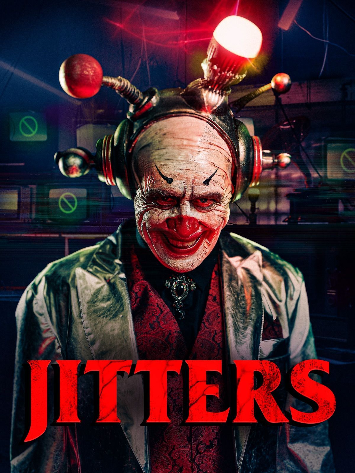
Jitters
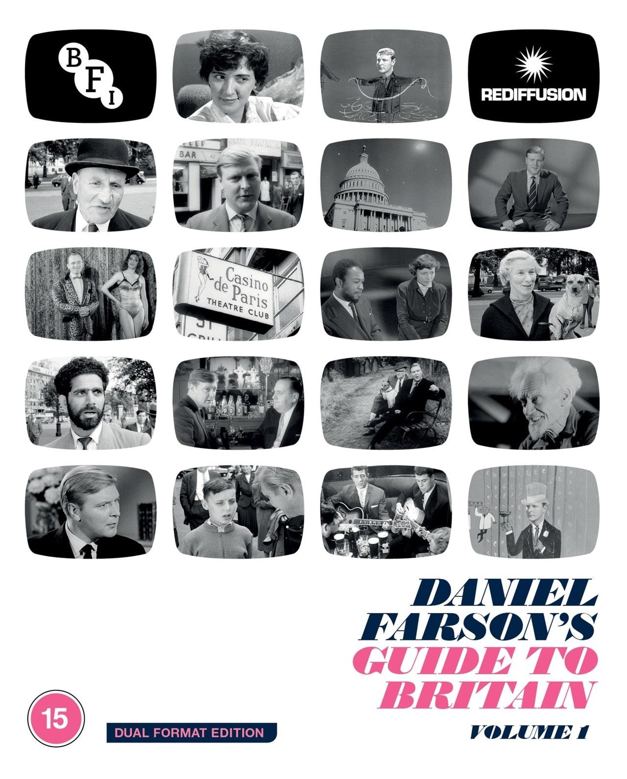
Daniel Farson's Guide To Britain Vol 1
or, Les Levres Rouge
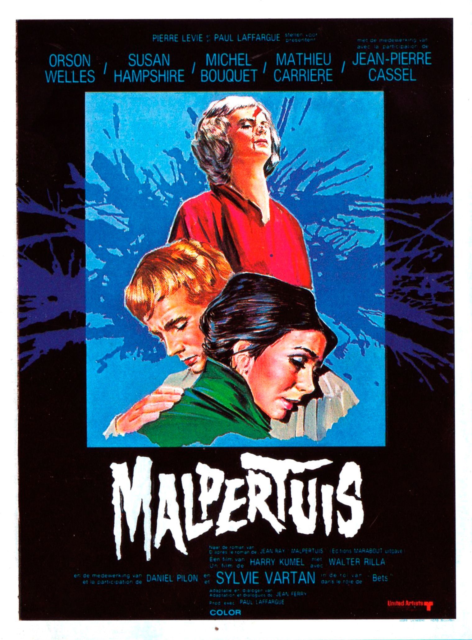
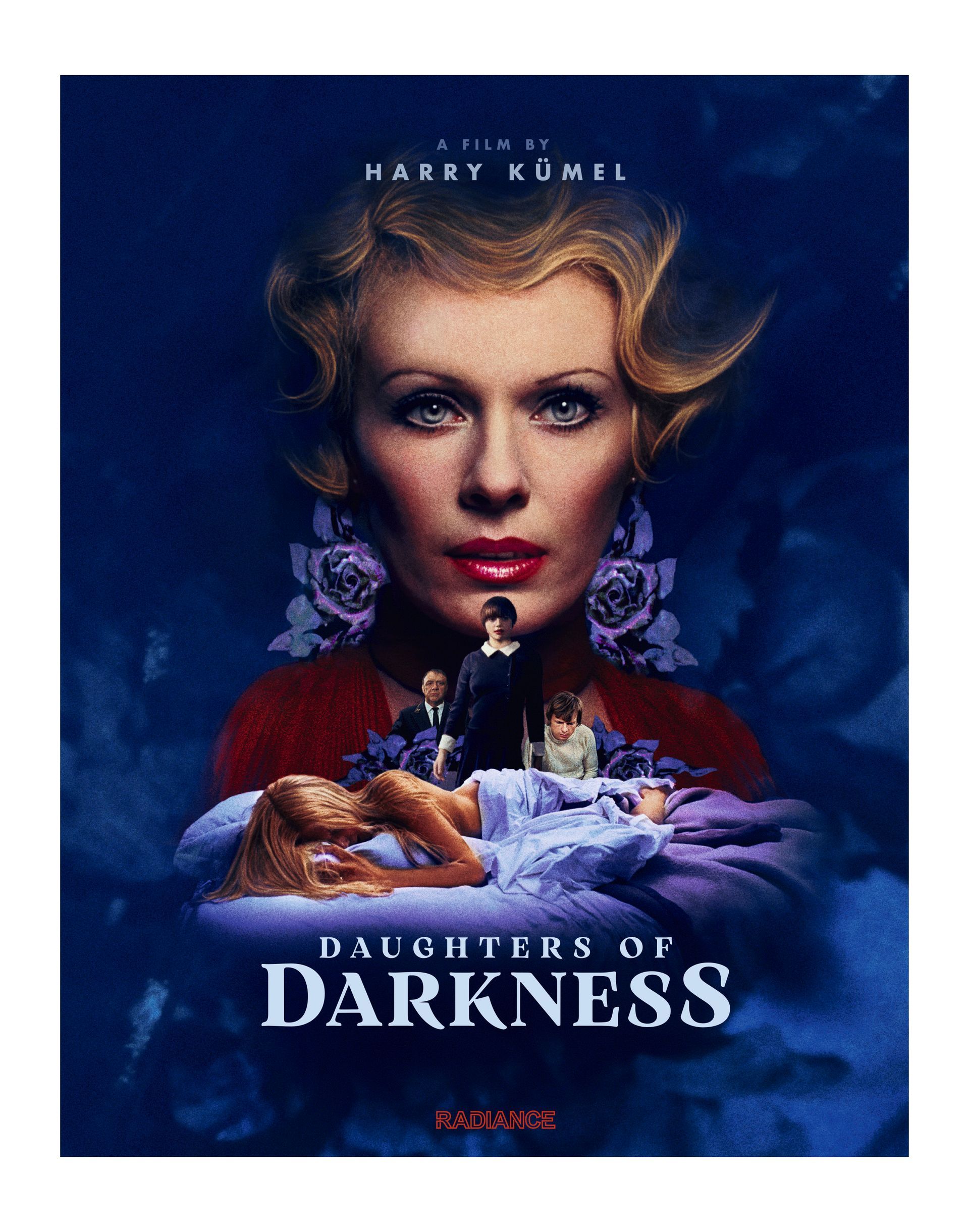
Malpertuis
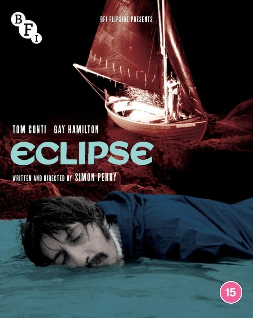
Eclipse (1977)
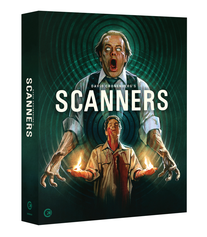
Scanners (1981)